If you are a graphic designer or you are planning to create your company logo, you should read this article to find out amazing ideas to design a smart logo that wows.
1. Be Simple 
There are a million companies; there are a million ideas to design a company logo. If your logo doesn’t work out right, the reason probably is complexity. Thus, think about simple concept; remove some elements, instead of adding them. Nike is famous with its simple logo. Let’s look at it and start with your simple yet professional ideas.
2. Engage The Audience
The logo should engage the audience. It shouldn’t be too literal or too abstract because the audience doesn’t like these styles. Thinking about your clients to know what they will remember your logo. If it is literal, as a result it doesn’t impress customers. If it is abstract, few people understand it. Don’t forget that the consumer is accustomed to various media, so make your logo appear in as many sites as possible. This is another way to engage the audience.
3. Be Dynamic
Why don’t you create dynamic various patterns on your logo such as words, symbols, adaptability, and flexibility in order to make your logo be eye-catching? The following is an illustration for this type of company logo.
4. Be Versatile 
Apple’s logo is an example of being versatile. By using this logo design, your logo will look great and boring-free because of the change of different colors. Of course, the original design is the main logo that people still remember its shape and features.
5. Be Unique
This is not only a matter of choice but also a matter of doing business and copyright. If you have the same logo idea to another company, you may be sued for stealing that company’s logo idea. It’s not fair. Be unique to create your own impression on the audience! Make sure that you do not repeat other logo designs by checking company names.
6. Be Meaningful And Memorable 
To impress more clients, make your logo be meaningful in different ways. Firstly, it should be an artwork. Your logo is a short story. The color(s) of your logo can expose some significant things. For instance, green symbolizes environment, the orange color is stand for friendship. The logo of Toyota is a remarkable example. According to this company, 3 ovals have special meanings. The 2 overlapping ovals represent the faith, the encircling oval stand for global expansion of Toyota business. Let’s take a look at this logo.
7. Vector Is A Good Choice
In some cases, clean lines with limited colors are more effective than complex 3D rendering. A vector-based logo can provide you with the balance and contrast that is very important in the logo design. New capabilities in different vector-based programs can give you variety of 3D effects such as canter effects and tricks without losing the contrast.
8. Don’t Over-Innovate 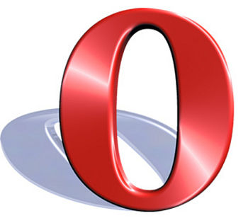
Of course, human’s innovation abilities are limitless. However, do not make your logo to become over-innovated. Actually, this is the way you make your logo be worse. As a result, this logo can reduce your company’s image and impact your business profits. Instead, be sure that you are going on track. Just make it is an art, do not force your mind to make it become a masterpiece, then it will become a wrong design. Remember that a successful logo design needs to be innovative enough and generic enough. Get started by sketching out your idea. Show your friends your new idea and the sketch. This is a good way to avoid over-innovating. And remember that your design is also a part of your personality that presents your thought, your point of view and your graphic knowledge. So, be careful and responsible in this business.
Now, look at Opera’s logo to seek a new idea for you logo design.
9. Don’t Make It Predictable
Next, remember that to design a company logo that wows, you should not make it predictable so that you can surprise the audience. Let’s view the logo of Lion Bird. At first, you just see its brand name and a bird. But, looking closer, you will see the entire picture of the colorful bird is a face of a lion. So, this is a really smart logo.
10. Use Old Sketches
Old sketches may give you a new graphic inspiration to design a company logo. Thus, do not throw all your sketches into the bin. The following is an example of a logo that came from a sketch
11. Find Logo Ideas On Graphic Sites 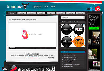
You can open an online logo designing site or a logo designing software to find logo ideas. Have ever you tried out Logo Moose, a great online logo design page? With this App, you will be able to design your own amazing logo. Beside Logo Moose, you also use Logo Gala and thousands of other great logo designing programs. Besides, you can use powerful Photoshop tools to create a perfect logo. This powerful guide can combine with other on-site graphic tools in the big family Adobe.
12. Choose A Typeface Carefully
Look at Microsoft’s logo below. As you can see, with a functional and clear typography, this logo look professional? Basically, typography should be central to a logo design. There are 2 routes to select: adapting a typeface from library or create your own typeface.
13. Don’t Use Gimmicky Fonts
Gimmicky fonts are too weak, too fancy and they are not suitable for designing logo, except for some special aims you want to carry out. In my opinion, instead of using gimmicky fonts, you can choose simple and classic fonts to avoid over-garnishing. In addition, do not forget to make the brand match the type.
14. Follow A Type-Only Design 
You can have many ideas to draw logo at the same time. But make clear all of these choices. Question yourself whether you can combine these ideas to become a good logotype. Firstly, look at the following logo. The graphic designer made it look harmony thanks to the well-matched combination among the red and the green; the circles and the quarters.
15. Use Space
As you can see below, the Fedex logo is a good example of using space to make the logo become unique and impressive at first glance. The letter E and the letter x are in negative space . There are a lot of other tips and tricks to design a company logo by using space. You can search for different company names to know how they have creative ways to use space in logo design.
16. Make Your Logo Active
This is a great idea to add movements to your logo design. You can create your logo based on some movement models. Besides, you can create new pattern in your design to make it an active and creative logo. Now, look at Twitter’s logo. This is a design with a flying bird with an opening beak.
17.Consider Colors And Tones
Colors and tones are very important in any visual presentation. The audience will not be interested in dull colors or boring colors in your logo. So make it look professional with the match of different colors and tones.
18. Be Experimental 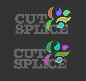
As you can see, the logo of Cut Splice is created with 2 versions and they are not similar totally. You can make it become creative in another incarnation of the experimental.
19. Use Dark Background
YouTube is a typical example of using dark background in logo design. Actually, many successful logos are created by using this graphic technique. The dark background makes the words become more outstanding. So, keep this tip in your mind.
20. If You Are In Doubt, Stop Doing It
If for any reason you think your design is not good. Check out whether it looks like another one, or some pasterns do not look professional, or it is lack of any significance. Moreover, ask your friends about impression when they view your logo. If you receive negative feedbacks, try to invest time and energy to make it “perfect”. Because logo is the face of your company, do not finish the final version if the audiences don’t like it. Just stop to think and find a new solution for some problems in your logo. Be consistent. Do not use 1 logo on the business card and another on social network such as Facebook profile. Besides, you should know that a fluid logo will be useful for you. It helps you be more creative but it won’t help you build your brand recognition.
21. Ask Your Clients Questions
It is necessary to ask your clients questions to know what they think about your logo such as “Do you like our logo?” . The feedbacks will help you know their satisfaction with your services or products. If the feedbacks are positive, you can keep the current logo and plan to update it later. If you get many negative feedbacks, it is time for you to take action.
22. Follow The Logo Design Process 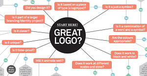
Here is a basic logo design process I highly recommend it to you for creating professional logo.
23. Know Its Meaning
Far beyond a perfect sketch, a strong logo should be filled with significance and meaning. For example, the logo of FedEx presents a movement forward and deliveries while the logo of Apple has a byte missing, and the logo of Twitter with a flying bird is an upward trajectory. In fact, it is not easy to have an idea for your logo. So, if it comes from your brain, remember to note your idea and start!
I’ve introduced the full 30 tips to design a company logo. Do you find these ways useful to learn?
If you like the writing and find it useful, share with your friends! As always I welcome all your feedbacks! Just feel free to send me your comment and question at the end of this post.
Want More Content Like This In Your Inbox?
- SRS trend rider system review – does Vladimir’s system work?
- Express Guitar Review – Can Mike Hayes’ Guitar Course Work?
- Job Search Tips For College Student To Over 50 In 2024
- How to change your mindset about life to be successful
- Squeeze Page Generator Software Review – Does It Work?
- Market Theme Download Review – Is It Reliable To Read?
- Unstippable offense program download review – is it reliable?
- Breaking Comedy’s Dna Download Review – Is It Reliable?


 10 Best homemade cat food recipes
  8 Common job interview questions and answers
  Play guitar fast and easy review – is Jerry’s guide useful?
  Skintervention Guide Review – Will Liz’s Program Work?
  Stop Nail Biting Secrets Review – Does Alex Rankin’s Guide Work?
  Rocket Italian Premium Review – Is Maria’s Italian Course Useful?
  Manifestation Miracle Review – Is Heather’s Guide Helpful?
  The Rastaman Vibration Book Review – Does This Course Work?
  11 Ways To Choose High Quality Watches For Men & Women!
  Spray Paint Art Secrets Review – Is It Trustable?